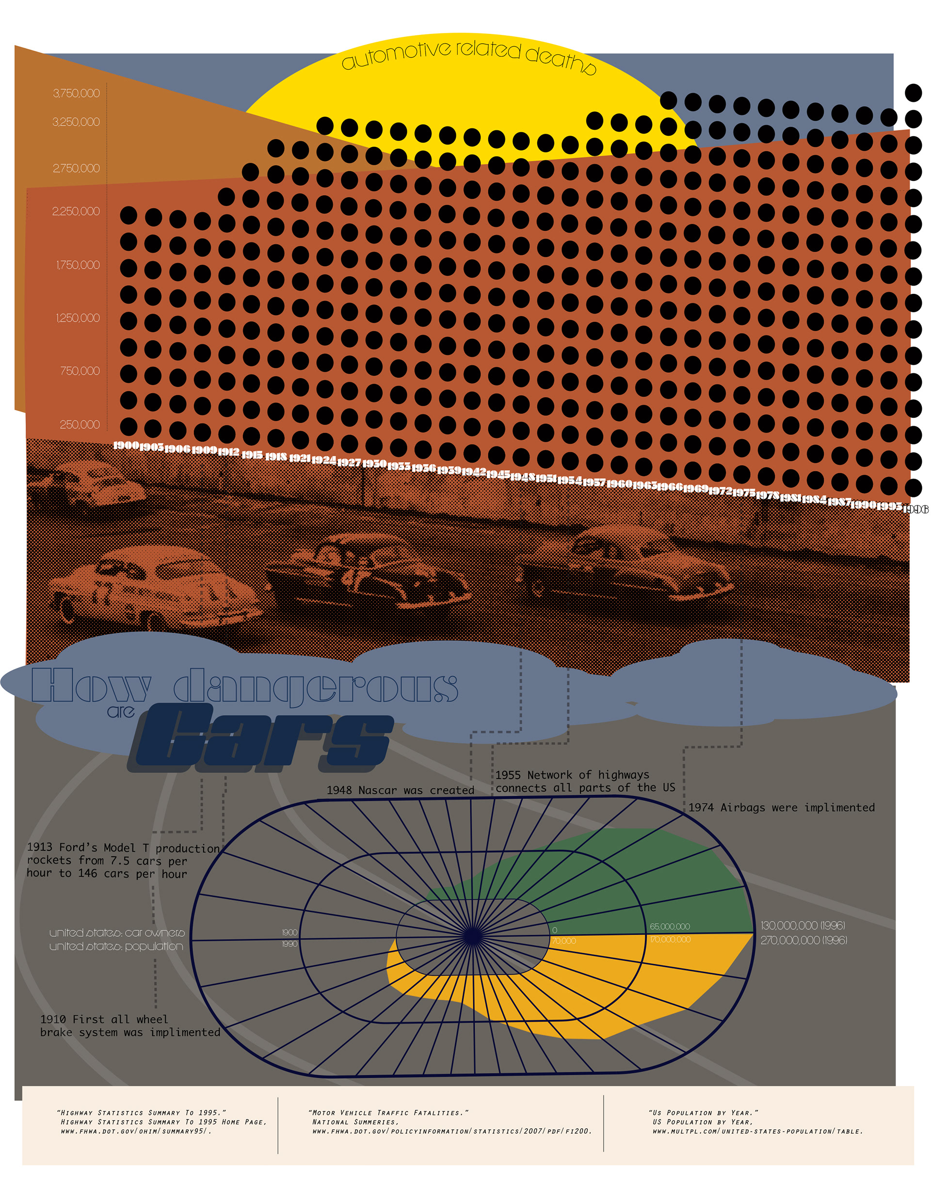
Car crash infographic
Working off a 50’s screen print aesthetic this infographic was meant to display the information associated with car deaths within a 100 year range.
Working off a 50’s screen print aesthetic this infographic was meant to display the information associated with car deaths within a 100 year range.


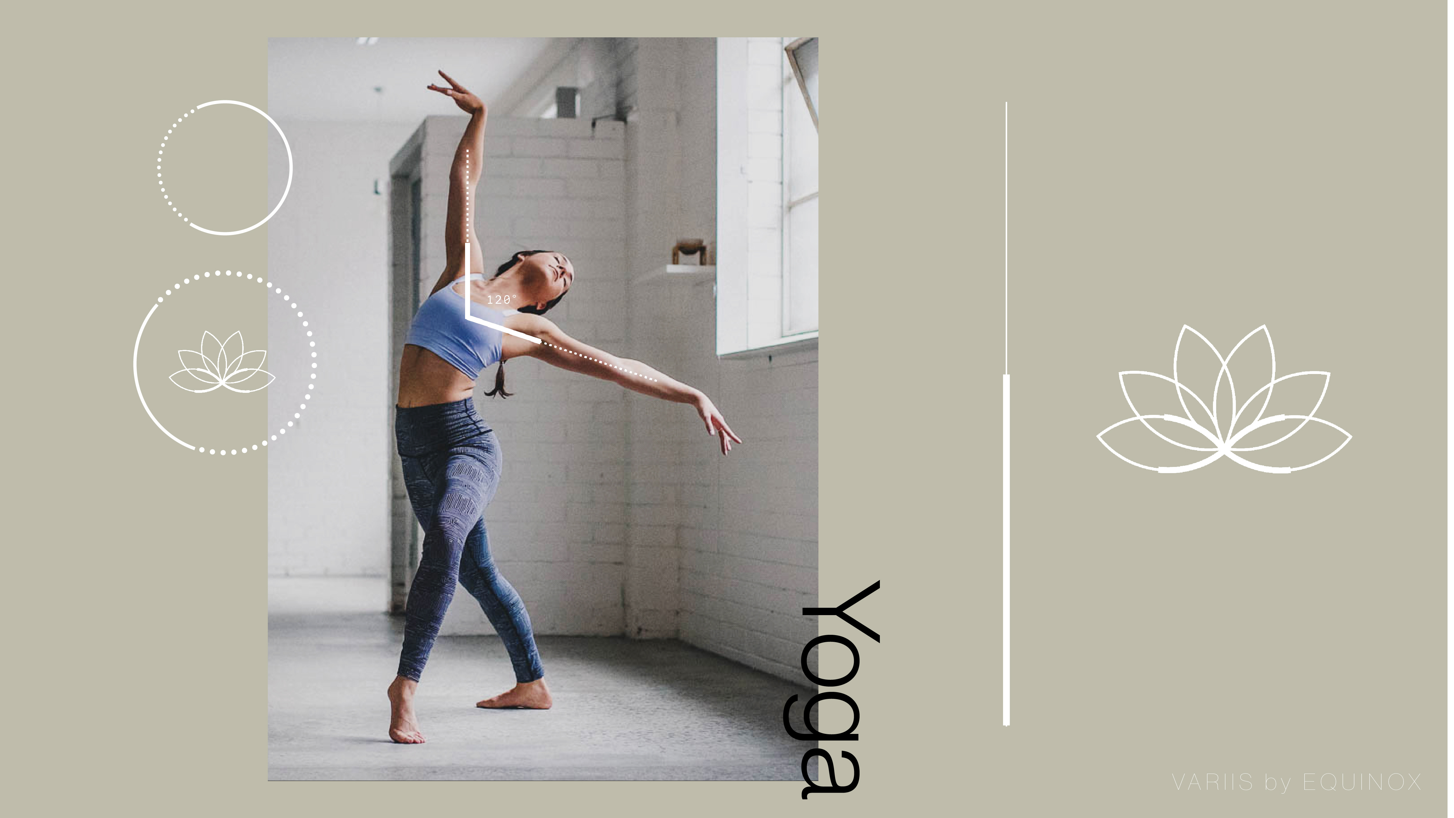
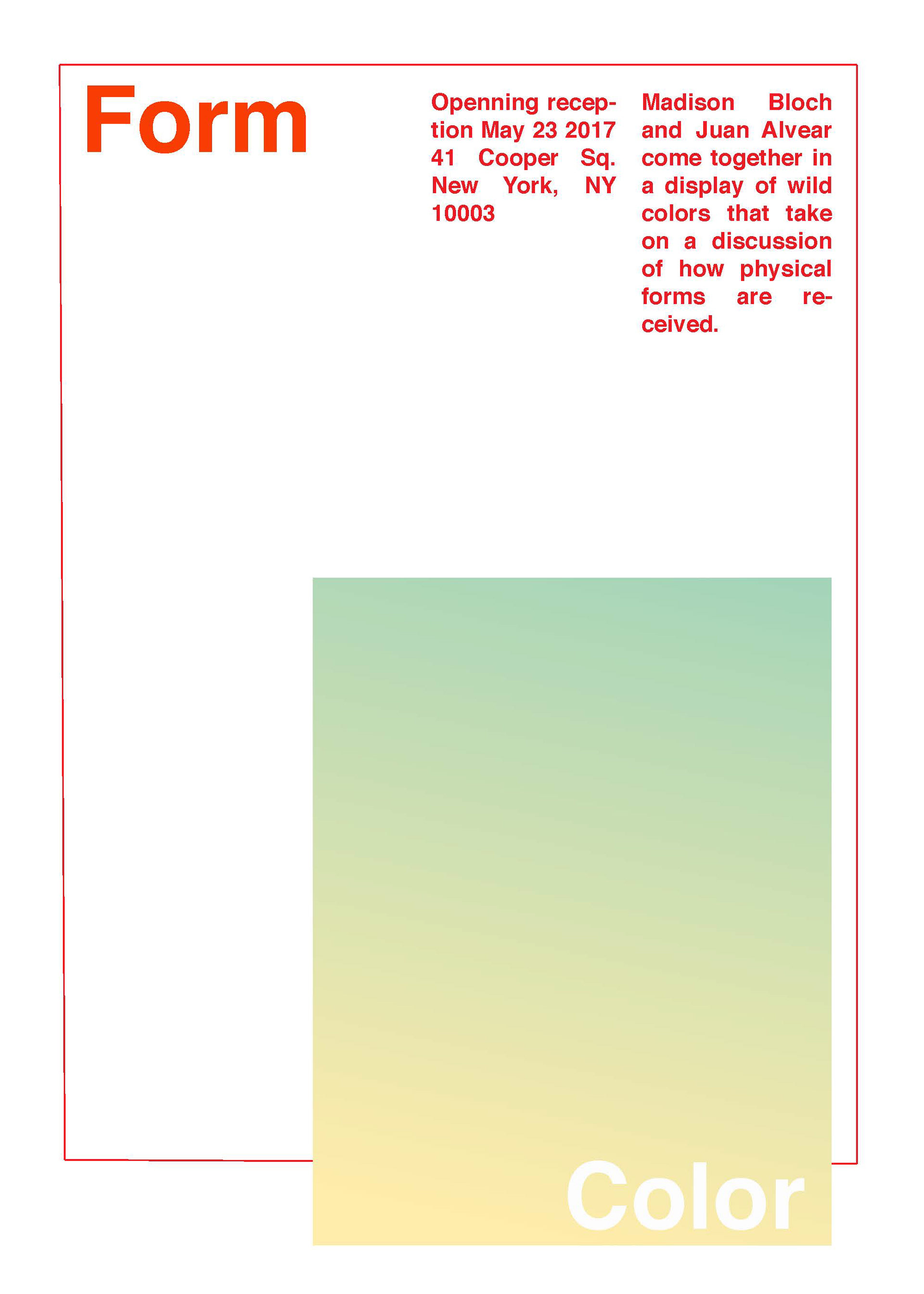
Exhibition Flyer 2
Created for a show collaboration exhibiting
our take on manipulating form and color. We wanted to show simplicity in line and grid work while creating a sense of curiosity. For instance the words “form” and “color” are realized through negative space rather than a topical treatment. This was meant to bring color in the forefront as the defining factor in the layout rather than text.
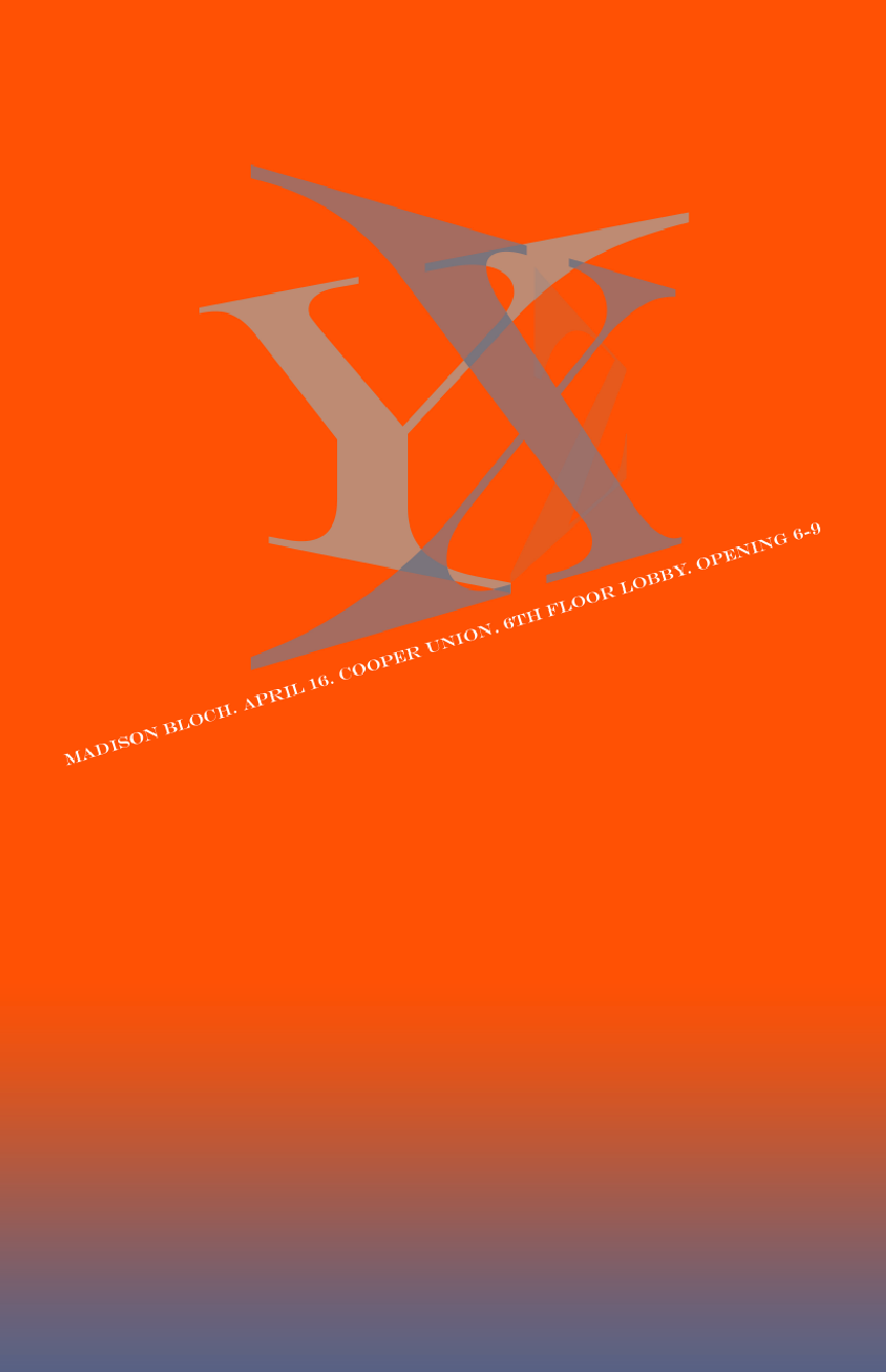
Exhibition Flyer 2019
Created for my senior painting show
at The Cooper Union. The show was
focused on the collaboration of the X,Y
and Z axis on a graph. Additionally it
worked to visualized the what defines
the physical world. The show had
significant visual motifs surrounding
gradients and horizon lines.
Created for my senior painting show
at The Cooper Union. The show was
focused on the collaboration of the X,Y
and Z axis on a graph. Additionally it
worked to visualized the what defines
the physical world. The show had
significant visual motifs surrounding
gradients and horizon lines.

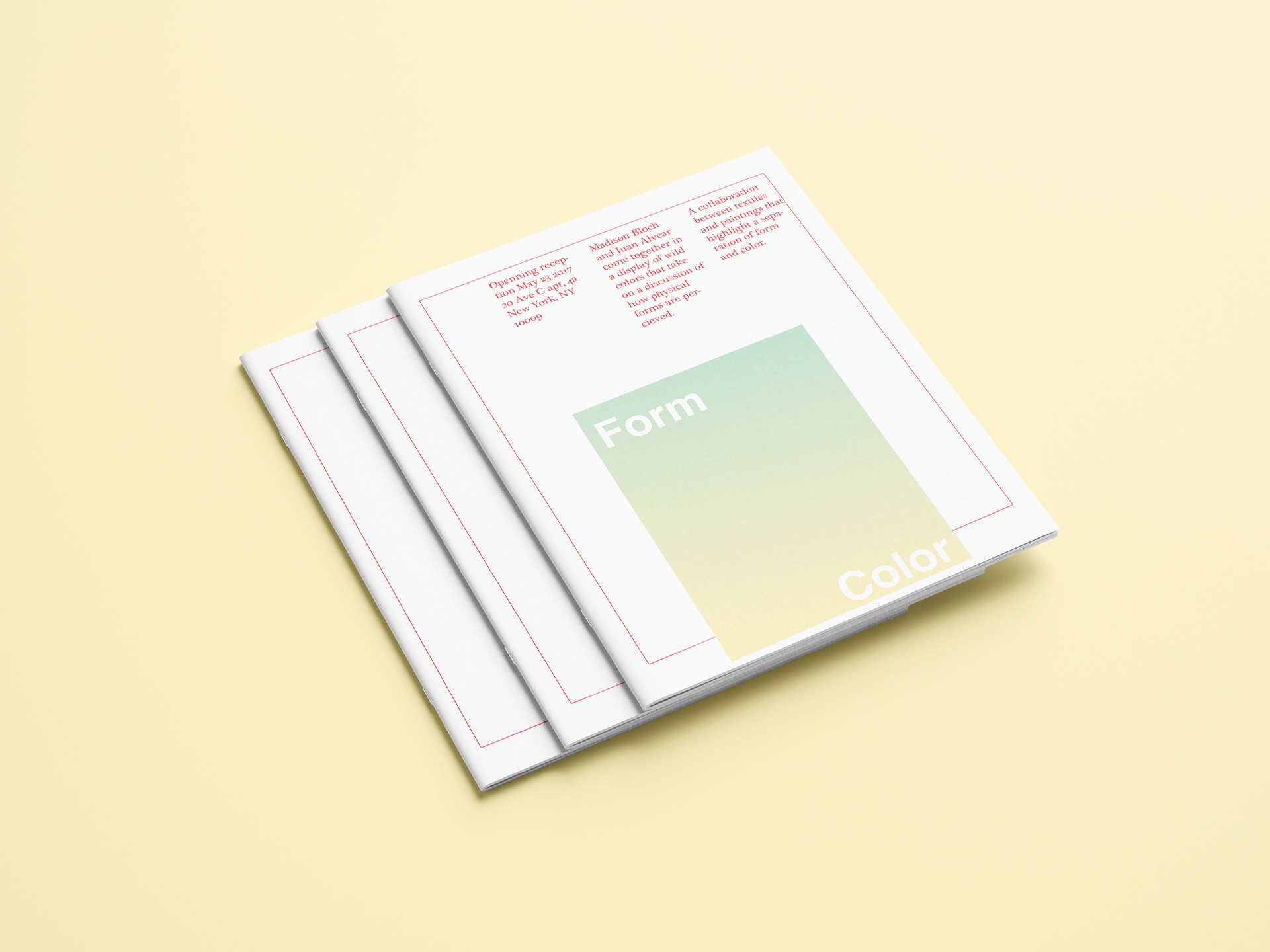
Exhibition Flyer 2 2018
Created for a show collaboration exhibiting
our take on manipulating form and color. We
wanted to show simplicity in line and grid work
while creating a sense of curiosity. For instance
the words “form” and “color” are realized through
negative space rather than a topical treatment.
This was meant to bring color in the forefront as
the defining factor in the layout rather than text.
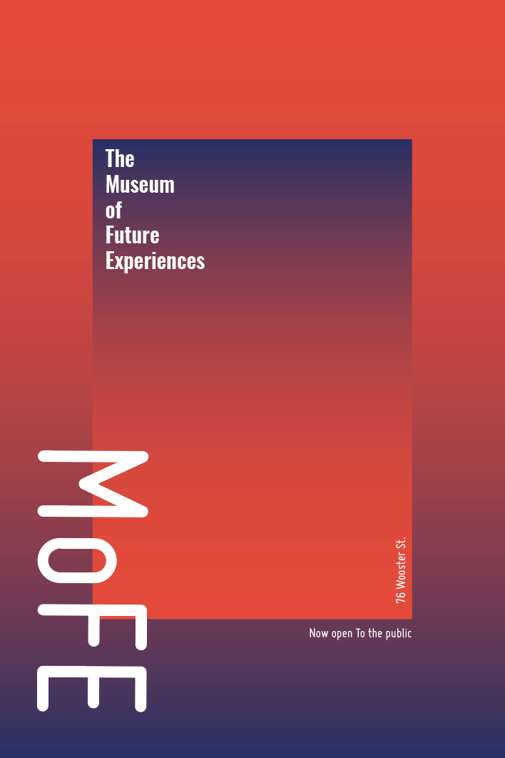
Museum of Future Experiences poster Design
These posters were created with the client
wanting a vague mystery surrounding what
“MoFE” would be if a customer came to
visit. Working on this curiosity I felt the idea
of infinite space and destruction of reality
(through type) worked well. In the second
poster I went for a more clean look based
off a gradient found on their website. This
piece was still in line with curiosity while
being “open to the public” kept the intention
of the poster clear.